10 key principles for data-driven storytelling
This is a specially adapted extract from a chapter in ‘Data Journalism: Past, Present and Future’, edited by John Mair, Richard Lance Keeble, Megan Lucero and Martin Moore; and published by Abramis Academic Publishing.
Last term as part of my Reporting II class at the University of Oregon, we looked at data journalism, working in groups to see how different news outlets were using data to tell stories across politics, sport, health and science.
Over the summer, I tweaked our findings – and conclusions from our classroom conversations – into a short book chapter, featured in a new book called ‘Data Journalism: Past, Present and Future’.
Based on our reading across these three thematic areas, and detailed research into coverage provided by seven different journalistic outlets, we were able to identify a series of important principles which all journalists using data should seek to abide by.
Many of these values are not just applicable to data storytelling; indeed, they should already be an established part of the journalist’s craft, but these principles are worth reiterating nonetheless, not least because – based on our reading and research – these core values are all too often overlooked.
Here are the 10 fundamental principles we identified:
- Don’t beat readers over the head with numbers. Data should be used to illustrate key points and help bring a story alive. The data itself is seldom the story, the implications of it need to be unpacked and explained, like in this piece from ProPublica about the complex way that Charles and David Koch spread their wealth in politics.
- Decide which tools allow you to tell a story best. Journalists have access to a plethora of means, including graphs, infographics, charts, tables and interactives to help tell a story. The value derived from each of these tools will vary depending on the story you wish to tell and the key data that you want to focus on.
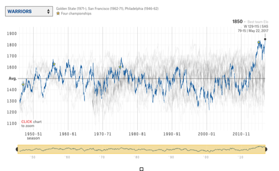
- Determine if you should develop a house style. When looking at sports stories, we found that each publication favoured a different way of incorporating data. When looking at basketball and the success of the Golden State Warriors, the San Jose Mercury News tended to weave stats (and in this case video) into stories to help make key points, SB Nation showed a preference for bar graphs, whilst FiveThirtyEight had a larger propensity for tables and complicated graphs.

- Determining your approach may be influenced by both the story you want to tell and the data literacy and preferences of your audience. Either way, your data-driven stories should be well designed so that audiences do not struggle to understand what’s being shown or how to interact with the data. For complex visualisations that may mean including some instructions (an idea too often overlooked by journalists), as well as links – including downloadable data files – to the original sources used in these efforts.
- Don’t link to blog/press releases, link to the actual study. These types of editorial shortcuts are often in evidence (Fox, we’re looking at you). But, in the hyperlinked economy, there is no excuse not to take your reader to the original source of the conclusions and data you are reporting on (as Quartz did, when covering the same story); thereby enabling readers to continue the journey – and check the veracity of your claims – for themselves.
- Provide proper attribution of your sources. Data-driven stories need to show their sources and avoid unattributed assertions. Unfortunately, especially in the health sphere, this is all too common. Journalistic assertions are often made without links to the evidence which can (one hopes) back them up. Don’t fall into the same trap.

- Ensure your links work. Linking to broken sites, or incorrectly inserting the correct address of a URL, is sloppy. If journalists don’t care enough about their work to get these basic elements right, is it any wonder that they fail to inspire confidence in some of their audiences? Doing these core tasks well is important, failure to do so merely helps erode trust in the profession.
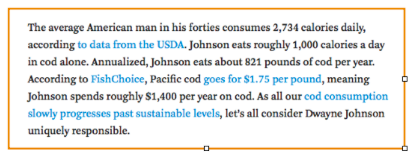
- Make it relatable and digestible. Data-driven storytelling still requires good writing and a story news sense. Data requires context and explanation. Be sure to provide it. One intriguing, and memorable, example of this can be seen in this 2015 piece on the diet of Hollywood actor and former pro-wrestler Dwayne ‘The Rock’ Johnson. The story breaks down Johnson’s diet and presents the information in a way that is easily consumed by any audience.
- Don’t overwhelm your audience. You don’t have to provide all of your data at once. Most stories work better if you decide which ingredients you wish to include, and where the focus should be: you don’t have to include every statistic you have access to. Be selective – whilst also being objective – with data in the same way as you would any other source.
- Good data journalism is harder to find than you might think. Data-driven storytelling includes many elements such as images, charts, graphics, visuals, stats and interactives. Finding and reviewing examples of great (and even not so great) work by other outlets (as we have sought to do) can inform and inspire your own efforts, as we all strive to improve our craft and be the best journalists that we possibly can be.
Damian Radcliffe is an Honorary Research Fellow at Cardiff University School of Journalism, Media and Cultural Studies and is also the Carolyn S. Chambers Professor in Journalism at the University of Oregon.

